Service design / UX and UI / Front-end
From interest.
To a clear next step.
I designed and built the digital journey for Unrent by Coposit, connecting a waitlist with 5,500+ signups to an eligibility form and the people who take qualification further.
A connected service.
A considered first step.
- Role
- Lead designer
Service, UX, UI and front-end - Team
- Product, concierge
and engineering - Scope
- Waitlist, email journey
and eligibility form - Platform
- Mobile-first web
and email - Timeline
- August 2026 to present
Ongoing - Result
- 5,500+
waitlist signups
Context
A different starting point for renters
Unrent by Coposit is an Australian proptech product for renters who can manage a regular housing payment but find the deposit a barrier to buying. Its proposition is to direct weekly payments towards a home deposit. Understanding whether it could suit someone takes more than interest in that idea.
I needed to help people understand the proposition, decide whether to explore it and share the information needed for an initial eligibility assessment. Because this touches both money and housing, the experience had to explain what would happen next without suggesting that an initial result was a final approval.
The waitlist brought that challenge into focus. With 5,500+ signups, the service needed a consistent first step in qualification. The form screens for initial eligibility; eligible applicants then move towards concierge contact and an assessment of borrowing capacity by Coposit's qualification team.
The challenge
Interest was only the beginning
The service had to make an unfamiliar idea understandable before asking people to share details about their circumstances. A landing page could introduce the proposition, but it could not carry every explanation, gather every answer and replace a conversation with the team.
I approached those tasks as a connected journey. The waitlist creates a low-effort entry point. Email explains what people have joined and prepares them for the form. The form gathers the information needed for an initial assessment, then makes the next step explicit.
That assessment is not a single question. Location affects availability. Buying alone or with someone else changes the household picture. Dependants and single-parent circumstances matter. Income needs different questions depending on whether someone is employed, works as a sole trader or runs a company.
The endings also needed care. Someone outside the service area should not receive the same explanation as someone who does not currently meet the financial criteria. Someone better suited to another pathway should have somewhere useful to go. A failed submission must never look like a completed assessment.
My challenge was to make those distinctions understandable while keeping the experience manageable. I needed a clear first qualification step that prepared people for human follow-up, kept assessment rules inside Coposit's infrastructure and gave each outcome its own explanation.
My contribution
My role across the service
I mapped the journey, designed the digital touchpoints and built the front-end. I owned the eligibility form, including its copy, interaction design and interface. I used rapid prototyping and usability testing on the form to review the experience as it developed.
Email strategy was a collaboration between the concierge and product teams. I designed and built the emails as part of the wider journey, connecting their calls to action to the landing page and form.
Coposit's engineers owned the back-end, including submission, storage and eligibility calculation. They deployed the experience on Coposit's own servers for security. I supplied test builds and handoff documentation so the team could review behaviour and integrate each release.
Service design
Designing one connected service
Give every stage a job
I mapped the journey around the decisions people needed to make. Discovery introduces Unrent, including through Coposit's existing audience. Joining the waitlist asks for a small commitment. The email journey then explains the proposition and prepares people to check their eligibility.
The form is the first qualification step. Its purpose is to identify the appropriate next route, not to complete the team's borrowing-capacity assessment. For people proceeding through the eligible route, call booking leads to concierge contact and the qualification team's further assessment.
Discover
Coposit audience email and wider promotion
Join
Waitlist landing page
Understand
Confirmation and explanatory emails
Qualify
Initial eligibility form
Connect
Outcome and relevant booking route
Concierge contact, then borrowing-capacity assessment by the qualification team.
I treated the handoffs between these stages as design decisions. The confirmation email sets expectations after signup. The explanatory emails give the form context. The outcome screens explain why a particular next step is being offered. People should not have to work out how disconnected pieces fit together.
Connect the visible experience to the work behind it
People see a page, an email, a question or a result. Behind those screens, Coposit needs reliable submissions, a server-side assessment and information the team can use when following up.
I designed the interface behaviour and handoff around that relationship. Engineering implemented and owned the back-end. My role was to make clear what the front-end needed to send, what responses it needed to handle and what a person should see when something went wrong.
| Stage | What people see | What supports it |
|---|---|---|
| Join | Page and signup confirmation | Submission handling and follow-up context |
| Understand | Email explanation and next action | Product and concierge strategy, Mailchimp delivery |
| Qualify | Relevant questions and a clear result | Coposit's server-side assessment |
| Connect | Booking and concierge contact | Qualification team assessment |
Across the journey: front-end test builds and handoff, with back-end implementation and deployment owned by engineering.
Principles that travelled across touchpoints
I kept the first commitment small, then asked for more information when its purpose was clear. An email address starts the waitlist journey; the initial interaction does not try to perform the whole assessment.
I also designed every touchpoint to prepare people for the next. The landing page, emails and form have different jobs, but share responsibility for explaining the service.
Finally, I treated uncertain and unsuccessful outcomes as part of the main experience. People need to understand a location restriction, an alternative route or a submission error just as clearly as an eligible result. Sensitive assessment logic stays with the team that owns it, inside Coposit's infrastructure.
The first commitment
Earn the next commitment
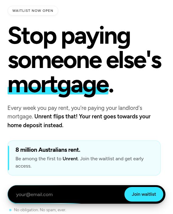
The waitlist page tells the story in stages: an introduction and video, a comparison, how the proposition works, the thinking behind it, the team and a founder's note. Each section adds context before another opportunity to join.
I kept the first interaction focused on email. Once someone chooses to continue, a details modal asks for their name, mobile number and weekly rent. Splitting this interaction keeps the opening request small while giving the team useful context for later conversations.
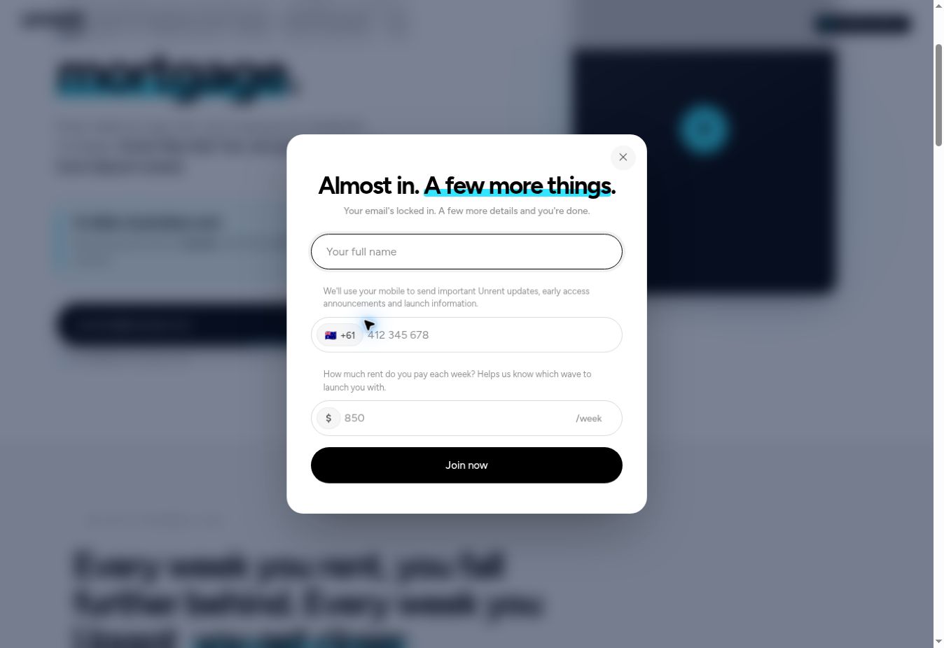
The mobile field uses an Australian prefix and checks the format. Weekly rent provides context about the person's existing housing payment; it is not presented as an eligibility decision. These details are collected before the completed signup is sent.
I also accounted for returning visitors. People who have already joined see an acknowledgement instead of being repeatedly asked to sign up. That small change keeps the page consistent with the relationship already established.
The waitlist has reached 5,500+ signups. I use that as evidence of interest in the product, rather than claiming a measured conversion improvement from any individual design decision.
The email journey
Email as the bridge to qualification
A set of messages with distinct roles
I designed five production emails for Mailchimp. They are not a mandatory sequence of five sends: the set includes a combined welcome alternative and an introduction for Coposit's existing audience.
The waitlist confirmation acknowledges the signup and sets expectations. "Why Unrent exists" gives the thinking behind the product, supported by a team video. "How it works" explains the model and links to the eligibility form, moving the journey from interest towards qualification.
The combined welcome brings the confirmation and explanation together when a single message is more appropriate. The Coposit-branded introduction provides a separate entry point for people who already know the company.
Waitlist confirmation
Acknowledge the signup and set expectations.
Why Unrent exists
Explain the thinking, with a team video.
How it works
Explain the model and lead into eligibility.
Combined welcome
An alternative that combines confirmation and explanation.
Introducing Unrent
A Coposit-branded entry point for its existing audience.
Journey diagram, not email screenshots. The combined welcome is an alternative, not an additional required send.
I worked with the concierge and product teams on the strategy. My design task was to give each message a clear purpose and make its next action understandable. The emails carry some of the explanation that would otherwise compete with the questions inside the form.
Design for the inbox people actually use
Email clients place practical limits on an interface. I built call-to-action buttons for consistent rendering and included a plain-text link beneath each one, so the action remains available when styling is stripped.
For video, I used a linked frame with a play button that opens YouTube. This avoids depending on in-email playback support and makes the intended action clear before someone leaves their inbox.
Image delivery needed attention too. Embedded logos failed to display in the Gmail app. Switching to hosted images addressed that issue. The decision was about making the communication recognisable when it arrived, rather than relying only on how it looked in a design file.
I also tried swapping logos between light and dark modes. Gmail and Outlook.com handle dark mode differently, and the additional complexity outweighed the benefit, so I removed that approach. Keeping a simpler implementation was a deliberate trade-off for maintainability across clients.
These decisions supported the same service goal: people should be able to understand the message and reach the next step from their inbox.
The centrepiece
Make complex eligibility feel manageable
Ask only what applies
This section covers the ongoing form design. The live screenshots show the current entry and income screens; the diagrams explain the broader question and outcome logic across the work.
I designed the form as a series of focused screens, with later questions shaped by earlier answers. The live journey starts with contact details and initial buyer questions before moving into the person's circumstances. Within that journey, location, household and employment each introduce different branches.
Location establishes where someone wants to buy. Applicants considering South Australia, Tasmania or the Northern Territory are asked whether they are open to relocating. This distinguishes current availability from willingness to consider another area, rather than treating the location answer as the whole story.
Household questions account for buying alone or with a co-buyer, dependants and single-parent circumstances. If there is a co-buyer, employment and income questions repeat for that person. I wanted the questions to reflect the household being assessed rather than assume everyone buys in the same way.
Location
South Australia, Tasmania and Northern Territory introduce a relocation question.
Household
Buying alone or together, dependants and single-parent circumstances.
Employment
Income questions change to match how each buyer earns.
PAYG employee
Salary and pay frequency
ABN sole trader
Income after expenses
Company director
Company profit, with director wages added back
With a co-buyer, repeat the relevant employment and income questions. This diagram describes the design scope, not a screenshot of a single live path.
Employment required the clearest distinction. PAYG employees provide salary and pay frequency. ABN sole traders provide income after expenses. Company directors provide company profit, with director wages added back so their income is represented appropriately in the assessment.
A generic income field would hide those differences inside an apparently simple question. I made the question specific instead. That asks people to describe something they recognise, while leaving the assessment itself to the server.
I used rapid prototypes and usability testing on the form during development, reviewing the experience while the flow and interface could still be changed.
Design each ending deliberately
I designed five outcome screens because the reasons a journey ends are different. The result needs to explain what happened and make the next available action clear.
An eligible result leads to booking a call. It confirms a route into further qualification, not approval to buy a home. Concierge then contacts the person, and the qualification team assesses borrowing capacity.
The shared equity pathway offers a separate route when the assessment points towards that option. It has its own call-booking journey. Instead of presenting an alternative fit as a rejection, the screen explains that there is another conversation to have.
"Not in your area yet" separates geographic availability from financial eligibility. I added this outcome so someone who passes the financial assessment is not told they have failed simply because Unrent is not currently available where they want to live.
"Not eligible right now" gives a clear, respectful answer and a next step. It needs to be honest about the current result without making a judgement about the person or promising a future outcome.
"Submission failed" addresses a different problem entirely. Coposit's engineers identified that failed submissions were being silently ignored. I added a retry screen so the interface does not imply the team received answers when the submission has not succeeded.
Eligible
Book a call, then continue with concierge and the qualification team.
Shared equity pathway
Explore an alternative through its own booking route.
Not in your area yet
Understand that availability, rather than financial eligibility, is the restriction.
Not eligible right now
Receive a respectful explanation and the next available step.
Submission failed
Retry, with a clear indication that the answers have not been received.
Outcome design summary. These are explanatory cards, not captured product screens.
Keep assessment rules on the server
The browser gathers answers and presents the response. Coposit's server runs the eligibility assessment and returns the information the interface needs to show the appropriate result.
This division keeps eligibility rules out of the browser and applicant submissions within Coposit's infrastructure. Engineering owns that back-end implementation. I designed the front-end to work with its responses rather than duplicate the calculation in the interface.
It also separates changes to assessment rules from changes to presentation. Rules can be updated server-side without a front-end release when the response contract stays the same. If the questions or expected responses change, the teams still need to coordinate that release.
Make the handoff part of the design
I supplied test builds alongside releases so engineering could review individual end screens and simulate server responses. That made it possible to inspect an error or an alternative outcome without repeatedly completing the whole journey.
Versioning was tied to the data the wider team relies on. A major release signals changes to the data columns. A minor release changes behaviour without changing those columns. A patch covers copy or styling. The version communicates whether engineering needs to make a corresponding change.
| Release | What changes | What it signals |
|---|---|---|
| Major | Data columns | Coordinate the data structure with engineering |
| Minor | Behaviour, with the same columns | Review the updated flow and responses |
| Patch | Copy or styling | Review the presentation change |
I also documented details that can look minor in a screen but matter during integration: when a displayed label differs from a stored value, and when a field is intentionally blank for a particular employment type. These notes help preserve the meaning of the answers as they move between the interface and the back-end.
Let real cases shape the form
The form developed through successive iterations as the service needed to account for company directors, single parents, relocation and different outcome conditions. The location-specific result and retry screen made those distinctions more explicit. I treated this as continuing service design: refining the questions, responses and handoffs as more cases became visible, rather than considering the first set of screens the finished product.
Outcomes
What the work has delivered
The waitlist has reached 5,500+ signups. Around that interest, I designed a connected digital service spanning introduction, signup, explanation, initial eligibility and the route into a conversation.
The eligibility form is live. It provides the first qualification step, identifying people who can proceed to the next stage before Coposit's qualification team assesses their borrowing capacity. Concierge contact remains part of the service; the form supports that work rather than replacing the team's judgement.
The outcome design distinguishes eligibility, alternative pathways, location restrictions and technical failure. Server-side assessment keeps the rules within Coposit's infrastructure, while test builds and release notes support engineering's work.
These are delivery outcomes, alongside the waitlist result. I have not claimed changes in conversion, assessment speed or completion rates without measured evidence. The work remains ongoing.
Reflection
What I learned
Design the service before the screens
Mapping the journey helped me decide what each touchpoint needed to explain and what could wait. The form became easier to frame once I was clear about what the landing page and emails were preparing people to do.
Give the difficult endings equal attention
An unavailable area, an alternative pathway and a failed submission need different explanations. Designing those endings made the service more honest about what it could do next.
Match questions to people's circumstances
Different employment types need different income questions. The interface should help people describe their situation in familiar terms, rather than expose the way a system stores it.
Treat handoff as part of the experience
A result screen depends on a reliable submission and an understood response. Test builds, versioning and documentation are part of delivering that experience, even though applicants never see them.
Ongoing work
Continuing the work
The work is ongoing. I am continuing to refine the eligibility experience and prepare updates for engineering to release. The next measurement step is to establish useful analytics for the waitlist journey, so future decisions can be informed by how people move through it. That means agreeing the events and questions worth measuring, rather than treating the signup total as a complete account of the service's performance.
Explore the product